
You know that feeling when you’re building your own website, click “Publish,” lean back in your chair, and think… “Nailed it.”
Then you open it on your phone.
The text is microscopic. Every button is bright red. Half the menu disappeared. Your contact form is somehow asking people for their fax number. (Why?)
Listen. We’ve all been there.
Building your own website seems easy enough—until you’re three hours deep comparing fonts, moving the logo four pixels to the left, and wondering if every headline should be bold.
Spoiler alert: it shouldn’t.
The truth is, most small business website mistakes aren’t huge disasters. They’re dozens of tiny design decisions that slowly chip away at trust and make visitors leave before becoming customers.
If you’ve ever wondered “Why is my website isn’t generating leads?” or “How do I increase website conversions?”, your design might be part of the problem.
Let’s look at five surprisingly common web design mistakes—and how to avoid them.
The 5 web design mistakes we see all the time
1. Everything is bold.
If every headline, sentence, button, and paragraph is bold…nothing is bold.
Bold text is meant to guide attention. When everything screams, visitors don’t know where to look first. Your website becomes the digital equivalent of five people trying to talk over each other at a networking event.
Instead, create hierarchy. Make important things stand out. Let everything else breathe.
Your visitors should immediately know what’s most important without having to hunt for it.
2. There’s no clear call-to-action.
This one hurts. A visitor spends two minutes reading your website, likes what they see….and then leaves.
Not because they weren’t interested. Because they had no idea what to do next.
Should they call? Fill out a form? Book an appointment? Send a carrier pigeon?
Every page should answer one simple question: “What’s the next step?”
A clear call-to-action is one of the best website features for small businesses because it removes confusion and helps turn visitors into real leads.
3. Your navigation feels like a scavenger hunt.
Home. About. Services. Pricing. Contact.
Simple works. Some DIY websites accidentally become treasure maps with twelve menu items, dropdowns inside dropdowns, and page names that require interpretation.
Customers shouldn’t need detective skills to find your services.
Clear navigation improves user experience, supports local SEO for small businesses, and helps visitors quickly find the information they’re looking for.
The easier your website is to use, the more likely people are to stick around.
4. Your homepage tries to do everything.
We’ve seen homepages that start with company history. Then awards. Then mission statements. Then twenty paragraphs. Then stock photos of people pointing at laptops.
By the time visitors finally discover what the business actually does…they’ve already left.
A homepage isn’t supposed to answer every question. It’s supposed to answer the important ones.
→ Who are you?
→ What do you do?
→ Who do you help?
→ Why should someone trust you?
→ What should they do next?
A helpful homepage creates clarity, builds confidence, and supports how to get more leads for my business far better than endless walls of text.
5. There’s no breathing room.
Negative space sounds scary. It’s actually just empty space. And it’s one of the most important parts of good design.
When every inch of a webpage is packed with buttons, photos, text, testimonials, badges, and animations, visitors become overwhelmed.
Good design gives your content room to breathe.
Ironically, adding a little less often helps people notice a lot more.
Yep. Empty space is working harder than you think.
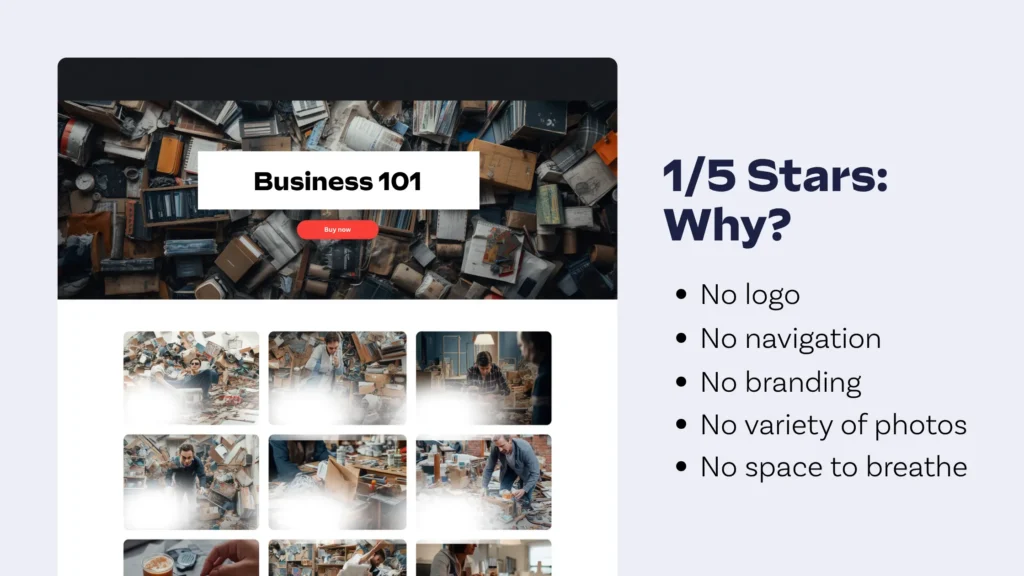
Small design mistakes = expensive business mistakes.
Here’s the myth: “My website doesn’t need to be perfect.” That’s true. It doesn’t.
But it does need to make people trust you.
When visitors land on an outdated, cluttered, or confusing website, they don’t usually think, “This navigation needs improvement.”
They think… “Maybe I’ll keep looking.”
That’s a lost opportunity.
For entrepreneurs searching how to attract new customers, how to grow a small business, or marketing on a budget, your website should be doing some of the heavy lifting—not creating more work.
A professional website improves credibility, supports digital marketing for local businesses, strengthens your brand, and helps convert traffic into actual conversations.
That’s why website redesign benefits go far beyond looking modern.
Better design can improve your website ROI for small businesses, strengthen your online presence, and help you compete with larger companies that have much bigger marketing budgets.
Sometimes the problem isn’t your marketing.
It’s the website your marketing is sending people to.
Good news! You don’t have to do this by yourself.
Running a business is already enough. You’re answering emails, managing customers, chasing invoices, putting out fires, and occasionally remembering to eat lunch.
Becoming a web designer probably wasn’t on your to-do list. That’s why Layerly takes a different approach.
Our done-for-you website design is built specifically for busy entrepreneurs who want a professional website without the hassle. Instead of wrestling with templates, guessing at SEO, or wondering why your buttons moved overnight, our team handles everything.
Real designers create custom layouts.
Real SEO strategists help you rank higher on Google and get found online.
Real developers build fast, responsive websites that actually generate leads.
Yes, we use AI. It helps us move incredibly fast.
But every website still receives a human-first approach because great design isn’t something artificial intelligence can completely replace.
The result? An affordable business website delivered in just five days.
Our website subscription service also includes website management services, website maintenance included, and ongoing updates, giving entrepreneurs a truly hands-off website solution.
You get to focus on running your business.
We’ll worry about the website.
Fair trade, right?
The bottom line
Most web design mistakes are completely fixable. A few thoughtful improvements—clear navigation, stronger calls-to-action, helpful content, better spacing, and smart visual hierarchy—can make a huge difference in how to increase website conversions and generate more leads.
And if reading this made you quietly whisper, “Uh-oh…my website does all five of those things,” don’t panic. Seriously. When you’re ready for something better, Layerly is here to help with custom websites, human-first design, built-in SEO, and an all-inclusive process that delivers a website in just five days.
Get started with Layerly. Book a call today!
