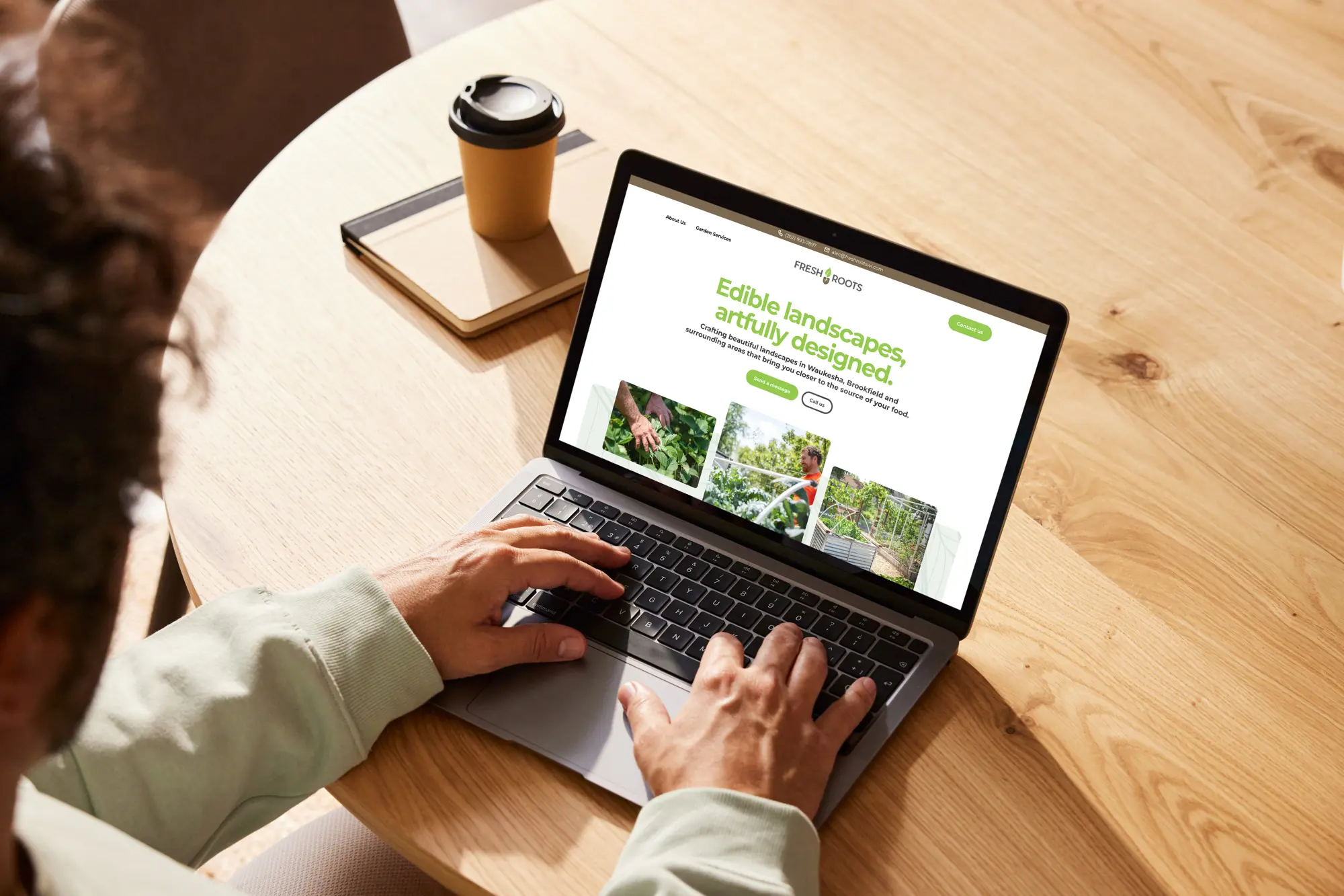
Your website’s homepage isn’t just any page. It’s the digital face of your brand — the virtual welcome mat for visitors worldwide. It’s where first impressions are made and where lasting connections are forged. In this comprehensive guide, we’ll dive into the essential components of a winning homepage, ensuring that your website not only shines but captivates and converts visitors.
Unpacking the anatomy of a homepage
Let’s start with the basics: the three pillars of website design—the header, the body and the footer. Within these structural elements lies the key to unlocking the full potential of your homepage, from aesthetics to functionality.
You might be wondering, “Why does this matter?”
Well, here’s the scoop — your homepage sets the stage for your entire online presence. It’s the digital storefront that calls visitors in to explore further. It is the hub of information that informs and directs action. Without a solid grasp of this structure, you risk missing out on opportunities to engage and convert your audience.
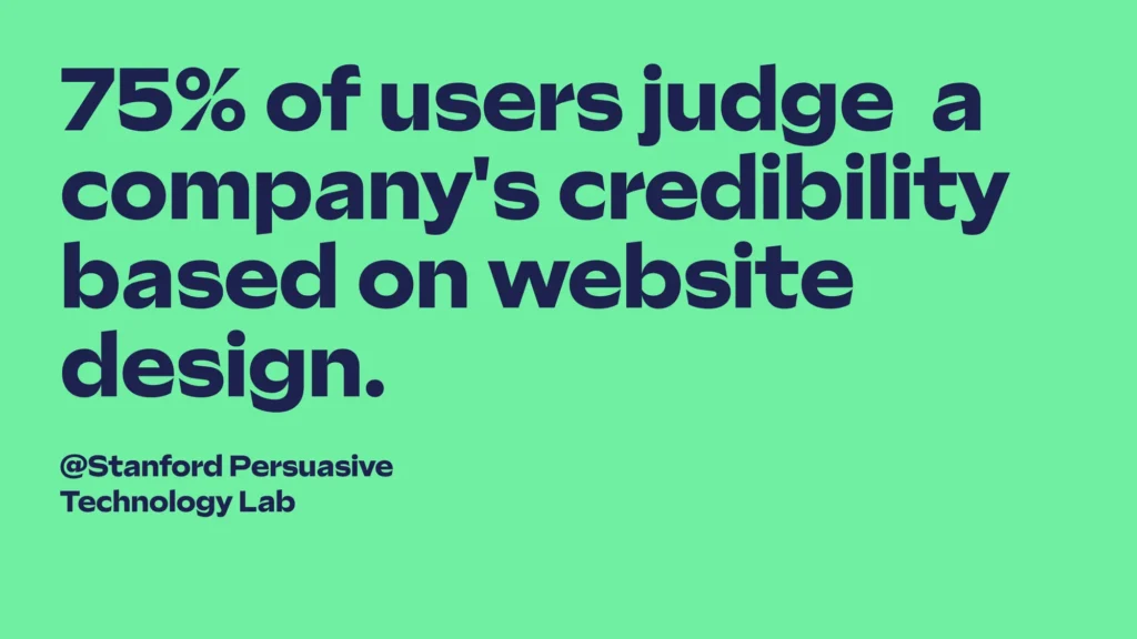
Consider this: Studies reveal that a whopping 75% of users assess a company’s credibility based on its website design1. Moreover, 88% of visitors are unlikely to return after a negative browsing experience2. And a staggering 70% of small business websites lack a clear call-to-action on their homepage3. Armed with these insights, it’s clear that optimizing your homepage is paramount to success in the digital arena.
Navigating the header: Your digital welcome mat
The website header houses three essential components: the logo, navigation and call to action. Positioned at the top of every page, it serves as a visual roadmap for users. Beginning with the logo, ensure it’s legible across all devices. Opt for a horizontal format for versatility on laptops and mobile phones, maximizing screen space.
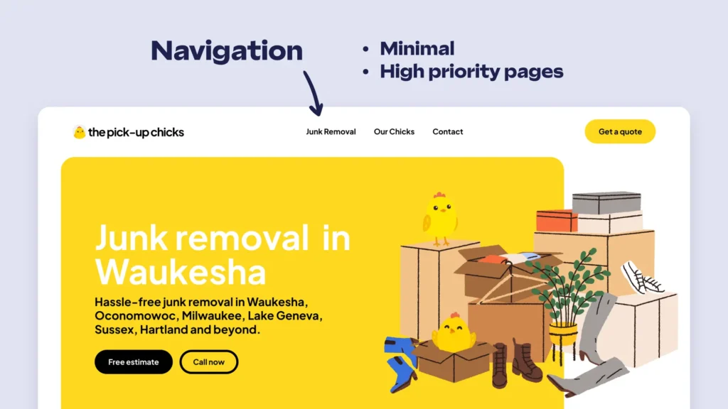
Your website navigation (think the tabs or links at the top of a website) helps users find important pages easily. To avoid confusing visitors, keep it clear and straightforward. Overloading it with too many options can make it hard to navigate.
Finally, your call to action should stand out prominently, guiding visitors with clear directives like “Contact Us,” “Book a Call,” or “Buy Now.” Avoid cluttering the header — simplicity is key here. Consider a top header for additional messaging like a sales banner or contact details, enhancing user engagement.
Crafting compelling content in the body
The body of your website includes all the words, pictures and videos that tell visitors about your business. It’s where people learn what you offer and why it matters.
Upon landing on your website, visitors will digest “above the fold” information. The phrase “above the fold” originated from newspapers, where the main headline and image were visible when the paper was folded. Similarly, websites present crucial content before users start scrolling. According to Facebook’s view measurement standard, viewers decide their interest within three seconds. If not engaged, they often move on.
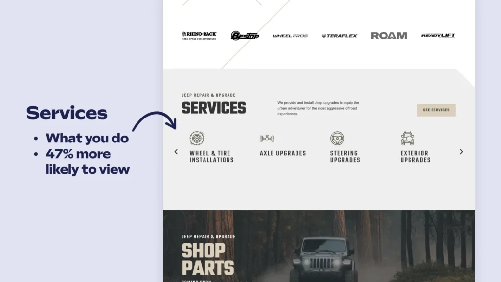
As visitors scroll, they delve deeper into your offerings and identity. Studies reveal a 47% of visitors check out a company’s products and/or services page before looking at any other pages of the site. Utilizing carousels, galleries or callouts to showcase services effectively is a great way to enhance visitor understanding of your offering.
Further down, describe your business’s ethos, service areas and clientele. Linking to relevant pages like “About Us” or location-specific details aids in SEO optimization, bolstering your online visibility.
Integrating social proof, such as testimonials or case studies, lends credibility and fosters trust among visitors. These authentic endorsements validate your business’s capabilities, influencing purchase decisions positively.
Concluding the homepage journey, reiterate calls to action to guide visitors toward desired actions. Though it seems like overkill, multiple calls to action increase engagement rates, ensuring no opportunity for conversion is overlooked. Empower visitors to take the next step in their journey with your business, emphasizing the value you offer to enhance their lives.
Anchoring your message with a solid footer
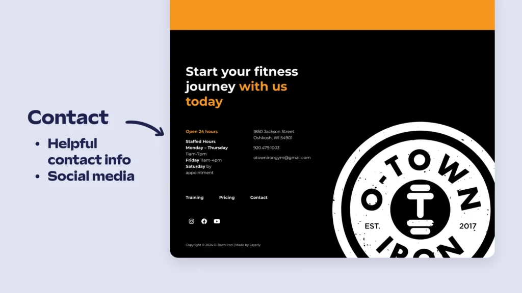
The footer, found at the bottom of every webpage, is like a helpful guide for visitors. It contains important contact details, links to social media and shortcuts to key pages, making it easy for people to find what they need on your site.
Including contact information like your business address, phone number and email makes it simple for visitors to reach out to you. This helps build connections and encourages questions or feedback. When this information is easy to find, it improves the experience for users. Adding links to your social media profiles encourages visitors to connect with your brand on different platforms. This can expand your reach and create a sense of community around your business.
Additionally, the footer acts as a way to navigate through your site. It lists all the pages, making it quick to explore different sections. This benefits visitors with different preferences and also helps with SEO by making your site easier for search engines to understand.
The footer is like a one-stop resource center, offering convenience, accessibility and support for visitors. It improves the overall user experience and opens up more opportunities for engagement.
Conclusion: Elevate your homepage, elevate your brand
Your website serves as the gateway for potential customers to discover and connect with your business. It’s crucial that visitors grasp your offerings and their relevance immediately upon landing on your homepage. Are your services clearly presented and is your website design optimized for seamless browsing across all devices?
Mastering your website homepage entails three key components: good design, ease of use and a clear call to action. If any of these elements are lacking, we’re here to help. With Layerly, we offer a solution that streamlines the process, providing you with a professional website in just 5 days. Our subscription is affordable and flexible, making it a perfect fit for most businesses. Plus, our team is dedicated to delivering a tailored experience, with one-on-one help to ensure your website is perfect for your needs.
Ready to optimize your website’s homepage? Book a call with us today for a free review and take the first step toward a high-converting website tailored to your business goals.
Sources
- Stanford Persuasive Technology Lab
- Gomez Report
- Small Business Trends
